
please step away from the project (modern southern bungalow week 29)
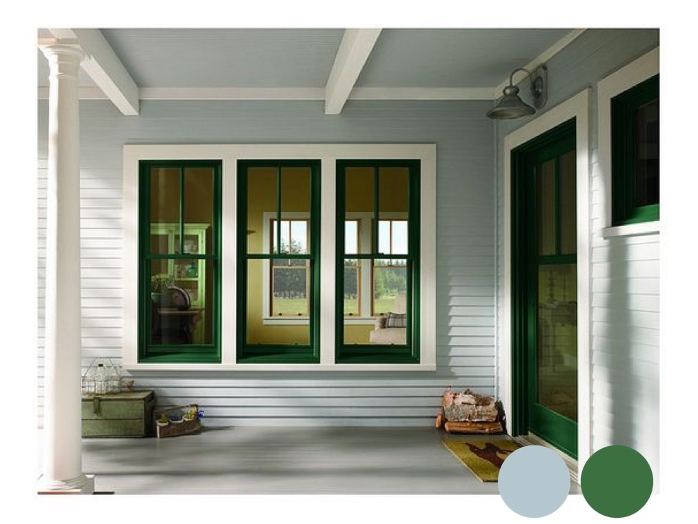
Inspiration photo via Andersen Windows
I had every intention of sharing our progress on picking paint colors last week. I even spent much longer than I’d like to admit drafting a post that I scrapped because it was totally not worth posting. I realized after letting go of the need to stay on an arbitrary posting schedule that I was using the writing process to try to break thru our color scheme for the house. Words are good for many things. Picking paint colors is not one of them.
The truth is, I was really stuck on making colors work in the house. Scared of committing to color. Scared of making a mistake and not having the budget to fix it. Scared things were going to either match too much or be so all over the place that our house would look like a showcase with each room designed by a different personality. Sometimes you actually do need to step away. No matter how many times I hear that message, I have finally learned that I may continue to need a reminder for the rest of my life. It is just paint after all.
They (whoever they are) say that a designer’s biggest challenge is designing for herself. I think that may be true. It is possible that what they really mean is that a designer’s biggest challenge is designing for her spouse. Also, let’s be honest, I’m rethinking my whole design philosophy around decorating *with* your kids. I mean, a girl can only handle so much blue paint. My son, on the other hand, wants his walls, trim, ceiling, and bed painted blue. And my daughter wants an Eiffel Tower painted on her wall. Just no.

The trim will actually be white, not gray. Software has limitations, that's why we put real paint on real boards to check color.
Here’s another truth. Sometimes, wasting time on the internet is exactly what you need to do to find your way. Through some random Facebook interactions and Pinterest pins this week, I stumbled on this blog series about Myers-Briggs personality types and decorating. If you don’t know your type, you can do a simple test here. I’m apparently an INFP, which means that I’m an idealist and a mediator. Also known as a mom.
Anyway, reading Naomi’s description of my personality in the context of design was a lightbulb moment. I am concerned about sourcing ethical and environmentally friendly goods and I beat myself up over buying cheap stuff at Target (but I still do it, let’s call it like it is). I could not be more in favor of minimal upkeep. Most importantly as relevant to this color selection process, I do prefer to shop alone, I do tend to seek perfection, and that means no, you can’t have navy walls, trim, and ceiling or an Eiffel Tower painted on your wall.
The second valuable thing I found on the internet this week was Le Corbusier’s color palette. Why did I not learn about this in school? I took an entire class on color and nothing? Le Corbusier was The Man. Truly. Read about him. Or just look at these windows. And yet no mention at all about his color theory. Take a look at these descriptions. “The sky reflected in water” (32033 céruléen clair). “The freshness of the forest” (32040 vert anglais). “A fascinating shade which reflects to infinity” (4320T bleu outremer foncé). Can I get a piece of that in my house please?
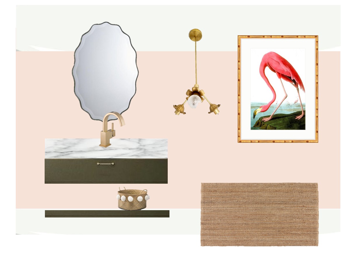
With this bit of inspiration, and the reminder of who I am as a decorator, my colors are coming together. I’ve got my son onboard with a blue paint that reflects to infinity (although if we are being academic, it leans a bit more towards indigo than ultramarine – my virgo is showing). I’ve got my husband onboard with kitchen cabinets as fresh as the forest (sorry - the link isn't working for this one) and “a gentle pink” that is “earthy, warm, and restrained” for the powder room.
Our guest room is leaning towards “the sky reflected in ocean waves” (you know you want to stay at my house – did see the part in that decorating for my personality type post about guest rooms?). I’ve almost nailed a dynamic and attention attracting blue for the TV room and we’ve got gently receding atmosphere selected for the outside of our house, with window sashes that express the summer. Painting starts next week (fingers crossed), so more to come.