
travel inspired decor that doesn't involve a map (modern southern bungalow week 24)

One of the things I keep coming back to from my California conference tour was Justina Blakeney’s story about how and why she chose the colors in her very blue bathroom. The story goes that Justina wanted a serene feeling in her bathroom, so she thought about places in her travels where she had felt the kind of calm that she was trying to evoke in the bathroom. For her, that place was Lake Tahoe. The deep blue of the lake inspired the deep blue of the shower tile.
This is a brilliant way to approach decorating. What if you really got in touch with the feelings you want to convey or attract for each space individually? What if you used those places where you find peace or inspiration or center as a muse for your own home? What if rather than hanging that map with 30 pins in it, you used your travels to inspire your decorating in a more unconventional way?
Those who know me even a little bit would not likely use “bohemian” as a way of describing my aesthetic. But just as you can take the girl out of the South but not the South out of the girl, so it is with the hippie within. One’s degree of crunchy, like all things, is on a spectrum. Justina Blakeney’s story about her bathroom awakened my own sleeping hippie (I did grow up in Eugene, after all, and yes, there was that period in high school when my wardrobe consisted of long flowy skirts and bell anklets).
Connecting a feeling to each room in the house isn't new, of course. We talked about this way back in week 14. What's new is the idea that we can hone in on specific places and pull colors or textures or shapes from those places in order to create the desired atmosphere in each room.
So my husband and I began brainstorming. What are the happiest, coolest, calmest, craziest, centering, open, invigorating places we’ve seen and been? Some of the places on the list were the same for both of us (dinner on a hillside in Corsica), others very different. I was surprised at some of the moments/places he added to the list and not by others. He was equally surprised by some of mine but not by others. We realized in the process of making our list that we already had a beach like vibe going in our master bathroom, and we were moving toward the colors of the lake in our bedroom.

(Also, total aside and not related to the lake but definitely related to travel inspired décor, can we talk for just a minute about these quilts? One of these will be somewhere in my house, you can bet on it. Probably going to be Rome, although New Orleans is definitely in the running.)
It hit me as we were making this list of places and experiences exactly what was inspiring my kitchen. While I knew that I wanted the feeling of my grandmother's kitchen with all its commotion, I also knew that I did not want the look (yellow formica countertops with dark brown cabinets and brick floors anyone?). One place from my original mood board kept coming back up. Café du Monde.
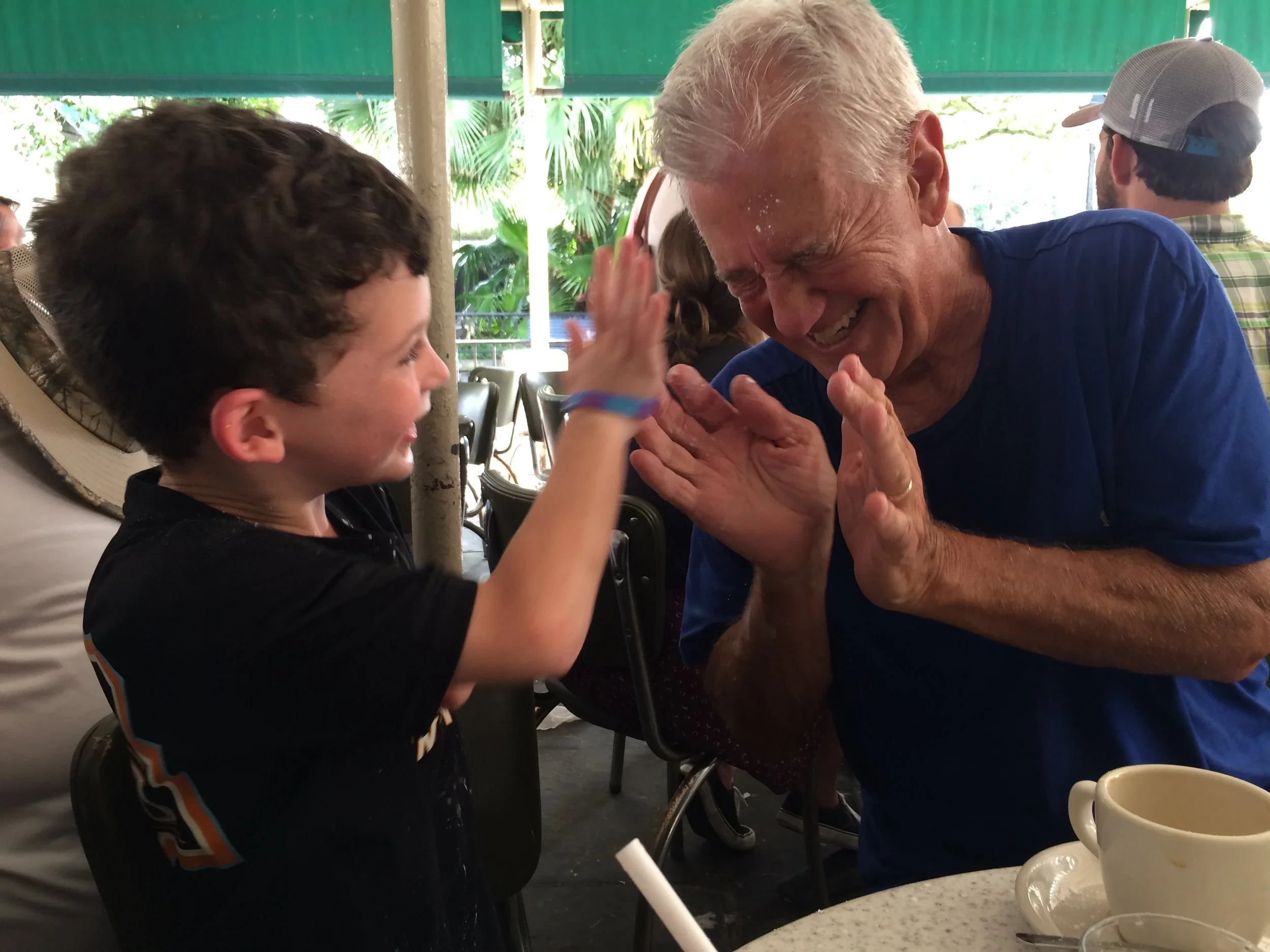

If you have ever been to Café du Monde, you know that you can't take yourself too seriously there. That is a vibe I want in my kitchen. If you have been to Café du Monde, you may also know its bold green and white striped awnings. Is it a coincidence that I've been collecting a lot of green cabinets on Pinterest? Maybe not. So when offered four sample pots from Behr’s 2018 Color Trends palette at a conference last month, I figured it was worth giving Equilibrium a try.

I like it quite a bit, actually. My concern with Equilibrium is that it might be just a bit too dark, making the kitchen feel closed in (especially with the full wall of cabinetry on one side). Happily, I also ordered a sample of Behr's In The Moment, which I painted on a board almost as an after thought, more out of curiosity than out of any interest in actually using it in the kitchen.

I've been sitting with these two colors for almost a week now. In The Moment has a nice feel to it - not too light, not too dark. Kind of green but kind of blue. Perhaps neutral enough to work with my crazy colored bowls and glassware. It also very much reminds me this photograph, which I stumbled on via the internet and which made its way into my original mood board for the house. Those of us who have been to Café du Monde know that this photo must have been filtered, but we can pretend that in certain lights of day, the table under our beignets and saucer under our coffee have a blue-green cast.
So now I would like your opinion. I can't promise to go with it, but if you'd like to vote, which would you chose? Equilibrium or In The Moment? Thanks for your help on this one. Don't worry. There are beignets in it for you.